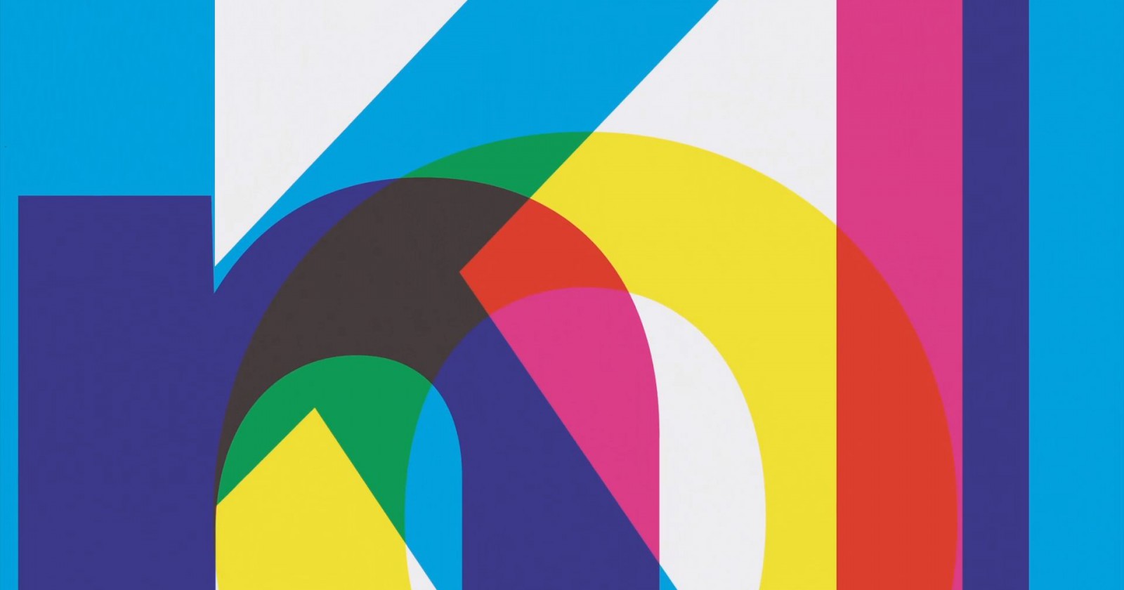
Helvetica Refreshed for the First Time in 35 Years17.04.2019
One of the most popular typefaces in the world has been given a makeover. Monotype Imaging, the company currently holding the rights to Helvetica, has just unveiled the revamped typeface.
Helvetica Now was developed over a two-year period. The redesign included minute changes to the shapes of the individual letters and the spacing between them. The goal of the makeover was to make the typeface more up to date and in line with modern standards. The updated font is available in three variants: micro (designed for mobile screens), display (ideal for captions), and text (for standard displays and print materials). Helvetica Now can be tested HERE.
The original Helvetica was developed in 1957 to be used as a print typeface, by Max Miedinger, a Swiss typeface designer, for Haas’sche Schriftgießerei. A digital version of Helvetica was developed in 1983.
Helvetica is absolutely ubiquitous. The typeface, renowned for its simplicity, has been used for book and magazine covers, posters, and in magazines. The biggest brands in the worlds, including American Apparel, Intel, Lufthansa, Nestlé, and Toyota have used it for its logotypes. Helvetica’s also widely used by many of us, as one of the fonts used in word processing suites—both in its original incarnation and its copies developed by other designers (the equally popular Arial being chief among them).
see also
- Michael Bierut: Design Is Democratic

People
Michael Bierut: Design Is Democratic
- Chris Duffey | AI Enhanced Creativity: Tomorrow’s Creativity is Here Today

Opinions
Chris Duffey | AI Enhanced Creativity: Tomorrow’s Creativity is Here Today
- Alicia Vikander to Star as a Child, an Adult, and an Elderly Woman in The National’s Latest Video Effort
News
Alicia Vikander to Star as a Child, an Adult, and an Elderly Woman in The National’s Latest Video Effort
- Łukasz Zabłocki: Creating parallel worlds
 Papaya Films
People
Łukasz Zabłocki: Creating parallel worlds

discover playlists
-
Tim Burton
 03
03Tim Burton
-
Music Stories PYD 2020
 02
02Music Stories PYD 2020
-
Paul Thomas Anderson
 02
02Paul Thomas Anderson
-
Original Series Season 1
 03
03Original Series Season 1